Sidebars are one of the most complex components to build. They are central to any application and often contain a lot of moving parts.
Kura includes the same composable sidebar primitives as the upstream component, styled for the Kura registry.
Installation
pnpm dlx shadcn-svelte@latest add sidebarWe'll go over the colors later in the theming section.
:root {
  --sidebar: oklch(0.985 0 0);
  --sidebar-foreground: oklch(0.145 0 0);
  --sidebar-primary: oklch(0.205 0 0);
  --sidebar-primary-foreground: oklch(0.985 0 0);
  --sidebar-accent: oklch(0.97 0 0);
  --sidebar-accent-foreground: oklch(0.205 0 0);
  --sidebar-border: oklch(0.922 0 0);
  --sidebar-ring: oklch(0.708 0 0);
}

.dark {
  --sidebar: oklch(0.205 0 0);
  --sidebar-foreground: oklch(0.985 0 0);
  --sidebar-primary: oklch(0.488 0.243 264.376);
  --sidebar-primary-foreground: oklch(0.985 0 0);
  --sidebar-accent: oklch(0.269 0 0);
  --sidebar-accent-foreground: oklch(0.985 0 0);
  --sidebar-border: oklch(1 0 0 / 10%);
  --sidebar-ring: oklch(0.439 0 0);
}
Copy and paste the following code into your project.
export const SIDEBAR_COOKIE_NAME = 'sidebar_state';
export const SIDEBAR_COOKIE_MAX_AGE = 60 * 60 * 24 * 7;
export const SIDEBAR_WIDTH = '16rem';
export const SIDEBAR_WIDTH_MOBILE = '18rem';
export const SIDEBAR_WIDTH_ICON = '3rem';
export const SIDEBAR_KEYBOARD_SHORTCUT = 'b';
import { IsMobile } from '$HOOKS$/is-mobile.svelte.js';
import { getContext, setContext } from 'svelte';
import { SIDEBAR_KEYBOARD_SHORTCUT } from './constants.js';

type Getter<T> = () => T;

export type SidebarStateProps = {
  /**
   * A getter function that returns the current open state of the sidebar.
   * We use a getter function here to support `bind:open` on the `Sidebar.Provider`
   * component.
   */
  open: Getter<boolean>;

  /**
   * A function that sets the open state of the sidebar. To support `bind:open`, we need
   * a source of truth for changing the open state to ensure it will be synced throughout
   * the sub-components and any `bind:` references.
   */
  setOpen: (open: boolean) => void;
};

class SidebarState {
  readonly props: SidebarStateProps;
  open = $derived.by(() => this.props.open());
  openMobile = $state(false);
  setOpen: SidebarStateProps['setOpen'];
  #isMobile: IsMobile;
  state = $derived.by(() => (this.open ? 'expanded' : 'collapsed'));

  constructor(props: SidebarStateProps) {
    this.setOpen = props.setOpen;
    this.#isMobile = new IsMobile();
    this.props = props;
  }

  // Convenience getter for checking if the sidebar is mobile
  // without this, we would need to use `sidebar.isMobile.current` everywhere
  get isMobile() {
    return this.#isMobile.current;
  }

  // Event handler to apply to the `<svelte:window>`
  handleShortcutKeydown = (e: KeyboardEvent) => {
    if (e.key === SIDEBAR_KEYBOARD_SHORTCUT && (e.metaKey || e.ctrlKey)) {
      e.preventDefault();
      this.toggle();
    }
  };

  setOpenMobile = (value: boolean) => {
    this.openMobile = value;
  };

  toggle = () => {
    return this.#isMobile.current ? (this.openMobile = !this.openMobile) : this.setOpen(!this.open);
  };
}

const SYMBOL_KEY = 'scn-sidebar';

/**
 * Instantiates a new `SidebarState` instance and sets it in the context.
 *
 * @param props The constructor props for the `SidebarState` class.
 * @returns  The `SidebarState` instance.
 */
export function setSidebar(props: SidebarStateProps): SidebarState {
  return setContext(Symbol.for(SYMBOL_KEY), new SidebarState(props));
}

/**
 * Retrieves the `SidebarState` instance from the context. This is a class instance,
 * so you cannot destructure it.
 * @returns The `SidebarState` instance.
 */
export function useSidebar(): SidebarState {
  return getContext(Symbol.for(SYMBOL_KEY));
}
import { useSidebar } from './context.svelte.js';
import Content from './sidebar-content.svelte';
import Footer from './sidebar-footer.svelte';
import GroupAction from './sidebar-group-action.svelte';
import GroupContent from './sidebar-group-content.svelte';
import GroupLabel from './sidebar-group-label.svelte';
import Group from './sidebar-group.svelte';
import Header from './sidebar-header.svelte';
import Input from './sidebar-input.svelte';
import Inset from './sidebar-inset.svelte';
import MenuAction from './sidebar-menu-action.svelte';
import MenuBadge from './sidebar-menu-badge.svelte';
import MenuButton from './sidebar-menu-button.svelte';
import MenuItem from './sidebar-menu-item.svelte';
import MenuSkeleton from './sidebar-menu-skeleton.svelte';
import MenuSubButton from './sidebar-menu-sub-button.svelte';
import MenuSubItem from './sidebar-menu-sub-item.svelte';
import MenuSub from './sidebar-menu-sub.svelte';
import Menu from './sidebar-menu.svelte';
import Provider from './sidebar-provider.svelte';
import Rail from './sidebar-rail.svelte';
import Separator from './sidebar-separator.svelte';
import Trigger from './sidebar-trigger.svelte';
import Root from './sidebar.svelte';

export {
  Content,
  Footer,
  Group,
  GroupAction,
  GroupContent,
  GroupLabel,
  Header,
  Input,
  Inset,
  Menu,
  MenuAction,
  MenuBadge,
  MenuButton,
  MenuItem,
  MenuSkeleton,
  MenuSub,
  MenuSubButton,
  MenuSubItem,
  Provider,
  Rail,
  Root,
  Separator,
  //
  Root as Sidebar,
  Content as SidebarContent,
  Footer as SidebarFooter,
  Group as SidebarGroup,
  GroupAction as SidebarGroupAction,
  GroupContent as SidebarGroupContent,
  GroupLabel as SidebarGroupLabel,
  Header as SidebarHeader,
  Input as SidebarInput,
  Inset as SidebarInset,
  Menu as SidebarMenu,
  MenuAction as SidebarMenuAction,
  MenuBadge as SidebarMenuBadge,
  MenuButton as SidebarMenuButton,
  MenuItem as SidebarMenuItem,
  MenuSkeleton as SidebarMenuSkeleton,
  MenuSub as SidebarMenuSub,
  MenuSubButton as SidebarMenuSubButton,
  MenuSubItem as SidebarMenuSubItem,
  Provider as SidebarProvider,
  Rail as SidebarRail,
  Separator as SidebarSeparator,
  Trigger as SidebarTrigger,
  Trigger,
  useSidebar
};
<script lang="ts">
  import type { HTMLAttributes } from 'svelte/elements';
  import { cn, type WithElementRef } from '$UTILS$.js';

  let {
    ref = $bindable(null),
    class: className,
    children,
    ...restProps
  }: WithElementRef<HTMLAttributes<HTMLElement>> = $props();
</script>

<div
  bind:this={ref}
  data-slot="sidebar-content"
  data-sidebar="content"
  class={cn(
    'no-scrollbar flex min-h-0 flex-1 flex-col gap-2 overflow-auto border-y border-[#222225] [--radius:0] group-data-[collapsible=icon]:overflow-hidden',
    className
  )}
  {...restProps}
>
  {@render children?.()}
</div>
<script lang="ts">
  import type { HTMLAttributes } from 'svelte/elements';
  import { cn, type WithElementRef } from '$UTILS$.js';

  let {
    ref = $bindable(null),
    class: className,
    children,
    ...restProps
  }: WithElementRef<HTMLAttributes<HTMLElement>> = $props();
</script>

<div
  bind:this={ref}
  data-slot="sidebar-footer"
  data-sidebar="footer"
  class={cn('flex flex-col gap-2 border-t border-[#222225] p-2', className)}
  {...restProps}
>
  {@render children?.()}
</div>
<script lang="ts">
  import { cn, type WithElementRef } from '$UTILS$.js';
  import type { Snippet } from 'svelte';
  import type { HTMLButtonAttributes } from 'svelte/elements';

  let {
    ref = $bindable(null),
    class: className,
    children,
    child,
    ...restProps
  }: WithElementRef<HTMLButtonAttributes> & {
    child?: Snippet<[{ props: Record<string, unknown> }]>;
  } = $props();

  const mergedProps = $derived({
    class: cn(
      'absolute top-3.5 right-3 flex aspect-square w-5 items-center justify-center border border-transparent p-0 text-zinc-500 outline-hidden transition-colors hover:border-[#b9d765]/50 hover:bg-[#18181b] hover:text-[#d0e891] focus-visible:ring-2 focus-visible:ring-zinc-300/60 group-data-[collapsible=icon]:hidden after:absolute after:-inset-2 md:after:hidden [&>svg]:size-3.5 [&>svg]:shrink-0',
      className
    ),
    'data-slot': 'sidebar-group-action',
    'data-sidebar': 'group-action',
    ...restProps
  });
</script>

{#if child}
  {@render child({ props: mergedProps })}
{:else}
  <button bind:this={ref} {...mergedProps}>
    {@render children?.()}
  </button>
{/if}
<script lang="ts">
  import { cn, type WithElementRef } from '$UTILS$.js';
  import type { HTMLAttributes } from 'svelte/elements';

  let {
    ref = $bindable(null),
    class: className,
    children,
    ...restProps
  }: WithElementRef<HTMLAttributes<HTMLDivElement>> = $props();
</script>

<div
  bind:this={ref}
  data-slot="sidebar-group-content"
  data-sidebar="group-content"
  class={cn('w-full text-sm text-zinc-400', className)}
  {...restProps}
>
  {@render children?.()}
</div>
<script lang="ts">
  import { cn, type WithElementRef } from '$UTILS$.js';
  import type { Snippet } from 'svelte';
  import type { HTMLAttributes } from 'svelte/elements';

  let {
    ref = $bindable(null),
    children,
    child,
    class: className,
    ...restProps
  }: WithElementRef<HTMLAttributes<HTMLElement>> & {
    child?: Snippet<[{ props: Record<string, unknown> }]>;
  } = $props();

  const mergedProps = $derived({
    class: cn(
      'flex h-8 shrink-0 items-center px-3 font-mono text-xs font-semibold uppercase tracking-[0.08em] text-zinc-500 outline-hidden transition-[margin,opacity] duration-200 ease-linear group-data-[collapsible=icon]:-mt-8 group-data-[collapsible=icon]:opacity-0 focus-visible:ring-2 focus-visible:ring-zinc-300/60 [&>svg]:size-3.5 [&>svg]:shrink-0',
      className
    ),
    'data-slot': 'sidebar-group-label',
    'data-sidebar': 'group-label',
    ...restProps
  });
</script>

{#if child}
  {@render child({ props: mergedProps })}
{:else}
  <div bind:this={ref} {...mergedProps}>
    {@render children?.()}
  </div>
{/if}
<script lang="ts">
  import type { HTMLAttributes } from 'svelte/elements';
  import { cn, type WithElementRef } from '$UTILS$.js';

  let {
    ref = $bindable(null),
    class: className,
    children,
    ...restProps
  }: WithElementRef<HTMLAttributes<HTMLElement>> = $props();
</script>

<div
  bind:this={ref}
  data-slot="sidebar-group"
  data-sidebar="group"
  class={cn(
    'relative flex w-full min-w-0 flex-col border-b border-[#222225] p-2 last:border-b-0',
    className
  )}
  {...restProps}
>
  {@render children?.()}
</div>
<script lang="ts">
  import type { HTMLAttributes } from 'svelte/elements';
  import { cn, type WithElementRef } from '$UTILS$.js';

  let {
    ref = $bindable(null),
    class: className,
    children,
    ...restProps
  }: WithElementRef<HTMLAttributes<HTMLElement>> = $props();
</script>

<div
  bind:this={ref}
  data-slot="sidebar-header"
  data-sidebar="header"
  class={cn('flex flex-col gap-2 border-b border-[#222225] p-2 [--radius:0]', className)}
  {...restProps}
>
  {@render children?.()}
</div>
<script lang="ts">
  import type { ComponentProps } from 'svelte';
  import { Input } from '$UI$/input/index.js';
  import { cn } from '$UTILS$.js';

  let {
    ref = $bindable(null),
    value = $bindable(''),
    class: className,
    ...restProps
  }: ComponentProps<typeof Input> = $props();
</script>

<Input
  bind:ref
  bind:value
  data-slot="sidebar-input"
  data-sidebar="input"
  class={cn(
    'h-8 w-full border-[#222225] bg-[#18181b] font-mono text-xs text-zinc-50 shadow-[inset_0_0_0_1px_rgba(161,161,170,0.1)] placeholder:text-zinc-500',
    className
  )}
  {...restProps}
/>
<script lang="ts">
  import { cn, type WithElementRef } from '$UTILS$.js';
  import type { HTMLAttributes } from 'svelte/elements';

  let {
    ref = $bindable(null),
    class: className,
    children,
    ...restProps
  }: WithElementRef<HTMLAttributes<HTMLElement>> = $props();
</script>

<main
  bind:this={ref}
  data-slot="sidebar-inset"
  class={cn(
    'relative flex w-full flex-1 flex-col bg-background md:peer-data-[variant=inset]:m-2 md:peer-data-[variant=inset]:ml-0 md:peer-data-[variant=inset]:rounded-none md:peer-data-[variant=inset]:border md:peer-data-[variant=inset]:border-[#222225] md:peer-data-[variant=inset]:shadow-none md:peer-data-[variant=inset]:peer-data-[state=collapsed]:ml-2',
    className
  )}
  {...restProps}
>
  {@render children?.()}
</main>
<script lang="ts">
  import { cn, type WithElementRef } from '$UTILS$.js';
  import type { Snippet } from 'svelte';
  import type { HTMLButtonAttributes } from 'svelte/elements';

  let {
    ref = $bindable(null),
    class: className,
    showOnHover = false,
    children,
    child,
    ...restProps
  }: WithElementRef<HTMLButtonAttributes> & {
    child?: Snippet<[{ props: Record<string, unknown> }]>;
    showOnHover?: boolean;
  } = $props();

  const mergedProps = $derived({
    class: cn(
      'absolute top-1.5 right-1 flex aspect-square w-5 items-center justify-center border border-transparent p-0 text-zinc-500 outline-hidden transition-colors hover:border-[#b9d765]/50 hover:bg-[#18181b] hover:text-[#d0e891] focus-visible:ring-2 focus-visible:ring-zinc-300/60 peer-hover/menu-button:text-[#d0e891] peer-data-[size=default]/menu-button:top-2 peer-data-[size=lg]/menu-button:top-2.5 peer-data-[size=sm]/menu-button:top-1 group-data-[collapsible=icon]:hidden after:absolute after:-inset-2 md:after:hidden [&>svg]:size-3.5 [&>svg]:shrink-0',
      showOnHover &&
        'peer-data-active/menu-button:text-[#d0e891] group-focus-within/menu-item:opacity-100 group-hover/menu-item:opacity-100 data-open:opacity-100 md:opacity-0',
      className
    ),
    'data-slot': 'sidebar-menu-action',
    'data-sidebar': 'menu-action',
    ...restProps
  });
</script>

{#if child}
  {@render child({ props: mergedProps })}
{:else}
  <button bind:this={ref} {...mergedProps}>
    {@render children?.()}
  </button>
{/if}
<script lang="ts">
  import { cn, type WithElementRef } from '$UTILS$.js';
  import type { HTMLAttributes } from 'svelte/elements';

  let {
    ref = $bindable(null),
    class: className,
    children,
    ...restProps
  }: WithElementRef<HTMLAttributes<HTMLElement>> = $props();
</script>

<div
  bind:this={ref}
  data-slot="sidebar-menu-badge"
  data-sidebar="menu-badge"
  class={cn(
    'pointer-events-none absolute right-1 flex h-5 min-w-5 items-center justify-center border border-[#222225] bg-[#18181b] px-1 font-mono text-[11px] font-medium tabular-nums text-zinc-400 select-none peer-hover/menu-button:text-[#d0e891] peer-data-active/menu-button:text-[#d0e891] peer-data-[size=default]/menu-button:top-1.5 peer-data-[size=lg]/menu-button:top-2.5 peer-data-[size=sm]/menu-button:top-1 group-data-[collapsible=icon]:hidden',
    className
  )}
  {...restProps}
>
  {@render children?.()}
</div>
<script lang="ts" module>
  import { tv, type VariantProps } from 'tailwind-variants';

  export const sidebarMenuButtonVariants = tv({
    base: 'flex w-full items-center gap-2 overflow-hidden border border-transparent px-3 py-2 text-left font-mono text-xs uppercase tracking-[0.04em] text-zinc-400 outline-hidden transition-[width,height,padding,background-color,border-color,color] hover:border-[#b9d765]/50 hover:bg-[#18181b] hover:text-zinc-50 active:border-[#b9d765]/50 active:bg-[#18181b] active:text-zinc-50 data-active:border-[#b9d765]/50 data-active:bg-[#18181b] data-active:text-[#d0e891] data-open:hover:border-[#b9d765]/50 data-open:hover:bg-[#18181b] data-open:hover:text-zinc-50 focus-visible:ring-2 focus-visible:ring-zinc-300/60 data-active:font-medium group-has-data-[sidebar=menu-action]/menu-item:pr-8 group-data-[collapsible=icon]:size-8! group-data-[collapsible=icon]:p-2! peer/menu-button group/menu-button disabled:pointer-events-none disabled:opacity-50 aria-disabled:pointer-events-none aria-disabled:opacity-50 [&_svg]:size-4 [&_svg]:shrink-0 [&>span:last-child]:truncate',
    variants: {
      variant: {
        default: '',
        outline: 'border-[#222225] bg-[#09090b] shadow-none hover:border-[#b9d765]/50'
      },
      size: {
        default: 'h-9',
        sm: 'h-8 text-xs',
        lg: 'h-14 px-3 text-sm group-data-[collapsible=icon]:p-0!'
      }
    },
    defaultVariants: {
      variant: 'default',
      size: 'default'
    }
  });

  export type SidebarMenuButtonVariant = VariantProps<typeof sidebarMenuButtonVariants>['variant'];
  export type SidebarMenuButtonSize = VariantProps<typeof sidebarMenuButtonVariants>['size'];
</script>

<script lang="ts">
  import * as Tooltip from '$UI$/tooltip/index.js';
  import { cn, type WithElementRef, type WithoutChildrenOrChild } from '$UTILS$.js';
  import { mergeProps } from 'bits-ui';
  import type { ComponentProps, Snippet } from 'svelte';
  import type { HTMLAttributes } from 'svelte/elements';
  import { useSidebar } from './context.svelte.js';

  let {
    ref = $bindable(null),
    class: className,
    children,
    child,
    variant = 'default',
    size = 'default',
    isActive = false,
    tooltipContent,
    tooltipContentProps,
    ...restProps
  }: WithElementRef<HTMLAttributes<HTMLButtonElement>, HTMLButtonElement> & {
    isActive?: boolean;
    variant?: SidebarMenuButtonVariant;
    size?: SidebarMenuButtonSize;
    tooltipContent?: Snippet | string;
    tooltipContentProps?: WithoutChildrenOrChild<ComponentProps<typeof Tooltip.Content>>;
    child?: Snippet<[{ props: Record<string, unknown> }]>;
  } = $props();

  const sidebar = useSidebar();

  const buttonProps = $derived({
    class: cn(sidebarMenuButtonVariants({ variant, size }), className),
    'data-slot': 'sidebar-menu-button',
    'data-sidebar': 'menu-button',
    'data-size': size,
    'data-active': isActive,
    ...restProps
  });
</script>

{#snippet Button({ props }: { props?: Record<string, unknown> })}
  {@const mergedProps = mergeProps(buttonProps, props)}
  {#if child}
    {@render child({ props: mergedProps })}
  {:else}
    <button bind:this={ref} {...mergedProps}>
      {@render children?.()}
    </button>
  {/if}
{/snippet}

{#if !tooltipContent}
  {@render Button({})}
{:else}
  <Tooltip.Root>
    <Tooltip.Trigger>
      {#snippet child({ props })}
        {@render Button({ props })}
      {/snippet}
    </Tooltip.Trigger>
    <Tooltip.Content
      side="right"
      align="center"
      hidden={sidebar.state !== 'collapsed' || sidebar.isMobile}
      {...tooltipContentProps}
    >
      {#if typeof tooltipContent === 'string'}
        {tooltipContent}
      {:else if tooltipContent}
        {@render tooltipContent()}
      {/if}
    </Tooltip.Content>
  </Tooltip.Root>
{/if}
<script lang="ts">
  import { cn, type WithElementRef } from '$UTILS$.js';
  import type { HTMLAttributes } from 'svelte/elements';

  let {
    ref = $bindable(null),
    class: className,
    children,
    ...restProps
  }: WithElementRef<HTMLAttributes<HTMLLIElement>, HTMLLIElement> = $props();
</script>

<li
  bind:this={ref}
  data-slot="sidebar-menu-item"
  data-sidebar="menu-item"
  class={cn('group/menu-item relative border-border/60', className)}
  {...restProps}
>
  {@render children?.()}
</li>
<script lang="ts">
  import { cn, type WithElementRef } from '$UTILS$.js';
  import { Skeleton } from '$UI$/skeleton/index.js';
  import type { HTMLAttributes } from 'svelte/elements';

  let {
    ref = $bindable(null),
    class: className,
    showIcon = false,
    children,
    ...restProps
  }: WithElementRef<HTMLAttributes<HTMLElement>> & {
    showIcon?: boolean;
  } = $props();

  // Random width between 50% and 90%
  const width = `${Math.floor(Math.random() * 40) + 50}%`;
</script>

<div
  bind:this={ref}
  data-slot="sidebar-menu-skeleton"
  data-sidebar="menu-skeleton"
  class={cn('flex h-8 items-center gap-2 border border-transparent px-2', className)}
  {...restProps}
>
  {#if showIcon}
    <Skeleton class="size-3.5 rounded-none bg-[#27272a]" data-sidebar="menu-skeleton-icon" />
  {/if}
  <Skeleton
    class="h-3 max-w-(--skeleton-width) flex-1 rounded-none bg-[#27272a]"
    data-sidebar="menu-skeleton-text"
    style="--skeleton-width: {width};"
  />
  {@render children?.()}
</div>
<script lang="ts">
  import { cn, type WithElementRef } from '$UTILS$.js';
  import type { Snippet } from 'svelte';
  import type { HTMLAnchorAttributes } from 'svelte/elements';

  let {
    ref = $bindable(null),
    children,
    child,
    class: className,
    size = 'md',
    isActive = false,
    ...restProps
  }: WithElementRef<HTMLAnchorAttributes> & {
    child?: Snippet<[{ props: Record<string, unknown> }]>;
    size?: 'sm' | 'md';
    isActive?: boolean;
  } = $props();

  const mergedProps = $derived({
    class: cn(
      'flex h-7 min-w-0 -translate-x-px items-center gap-2 overflow-hidden border border-transparent px-3 font-mono text-zinc-400 outline-hidden hover:border-[#b9d765]/50 hover:bg-[#18181b] hover:text-zinc-50 active:border-[#b9d765]/50 active:bg-[#18181b] active:text-zinc-50 data-active:border-[#b9d765]/50 data-active:bg-[#18181b] data-active:text-[#d0e891] focus-visible:ring-2 focus-visible:ring-zinc-300/60 data-[size=md]:text-xs data-[size=sm]:text-[11px] data-[size=md]:uppercase data-[size=sm]:uppercase data-[size=md]:tracking-[0.04em] data-[size=sm]:tracking-[0.04em] group-data-[collapsible=icon]:hidden disabled:pointer-events-none disabled:opacity-50 aria-disabled:pointer-events-none aria-disabled:opacity-50 [&>span:last-child]:truncate [&>svg]:size-3.5 [&>svg]:shrink-0 [&>svg]:text-[#d0e891]',
      className
    ),
    'data-slot': 'sidebar-menu-sub-button',
    'data-sidebar': 'menu-sub-button',
    'data-size': size,
    'data-active': isActive,
    ...restProps
  });
</script>

{#if child}
  {@render child({ props: mergedProps })}
{:else}
  <a bind:this={ref} {...mergedProps}>
    {@render children?.()}
  </a>
{/if}
<script lang="ts">
  import { cn, type WithElementRef } from '$UTILS$.js';
  import type { HTMLAttributes } from 'svelte/elements';

  let {
    ref = $bindable(null),
    children,
    class: className,
    ...restProps
  }: WithElementRef<HTMLAttributes<HTMLLIElement>> = $props();
</script>

<li
  bind:this={ref}
  data-slot="sidebar-menu-sub-item"
  data-sidebar="menu-sub-item"
  class={cn('group/menu-sub-item relative border-border/60', className)}
  {...restProps}
>
  {@render children?.()}
</li>
<script lang="ts">
  import { cn, type WithElementRef } from '$UTILS$.js';
  import type { HTMLAttributes } from 'svelte/elements';

  let {
    ref = $bindable(null),
    class: className,
    children,
    ...restProps
  }: WithElementRef<HTMLAttributes<HTMLUListElement>> = $props();
</script>

<ul
  bind:this={ref}
  data-slot="sidebar-menu-sub"
  data-sidebar="menu-sub"
  class={cn(
    'mx-3.5 flex min-w-0 translate-x-px flex-col gap-1 border-l border-[#222225] px-2.5 py-0.5 group-data-[collapsible=icon]:hidden',
    className
  )}
  {...restProps}
>
  {@render children?.()}
</ul>
<script lang="ts">
  import { cn, type WithElementRef } from '$UTILS$.js';
  import type { HTMLAttributes } from 'svelte/elements';

  let {
    ref = $bindable(null),
    class: className,
    children,
    ...restProps
  }: WithElementRef<HTMLAttributes<HTMLUListElement>, HTMLUListElement> = $props();
</script>

<ul
  bind:this={ref}
  data-slot="sidebar-menu"
  data-sidebar="menu"
  class={cn('flex w-full min-w-0 flex-col gap-0.5', className)}
  {...restProps}
>
  {@render children?.()}
</ul>
<script lang="ts">
  import * as Tooltip from '$UI$/tooltip/index.js';
  import { cn, type WithElementRef } from '$UTILS$.js';
  import type { HTMLAttributes } from 'svelte/elements';
  import {
    SIDEBAR_COOKIE_MAX_AGE,
    SIDEBAR_COOKIE_NAME,
    SIDEBAR_WIDTH,
    SIDEBAR_WIDTH_ICON
  } from './constants.js';
  import { setSidebar } from './context.svelte.js';

  let {
    ref = $bindable(null),
    open = $bindable(true),
    onOpenChange = () => {},
    class: className,
    style,
    children,
    ...restProps
  }: WithElementRef<HTMLAttributes<HTMLDivElement>> & {
    open?: boolean;
    onOpenChange?: (open: boolean) => void;
  } = $props();

  const sidebar = setSidebar({
    open: () => open,
    setOpen: (value: boolean) => {
      open = value;
      onOpenChange(value);

      // This sets the cookie to keep the sidebar state.
      document.cookie = `${SIDEBAR_COOKIE_NAME}=${open}; path=/; max-age=${SIDEBAR_COOKIE_MAX_AGE}`;
    }
  });
</script>

<svelte:window onkeydown={sidebar.handleShortcutKeydown} />

<Tooltip.Provider delayDuration={0}>
  <div
    data-slot="sidebar-wrapper"
    style="--sidebar-width: {SIDEBAR_WIDTH}; --sidebar-width-icon: {SIDEBAR_WIDTH_ICON}; {style}"
    class={cn(
      'group/sidebar-wrapper flex min-h-svh w-full has-data-[variant=inset]:bg-[#09090b]',
      className
    )}
    bind:this={ref}
    {...restProps}
  >
    {@render children?.()}
  </div>
</Tooltip.Provider>
<script lang="ts">
  import { cn, type WithElementRef } from '$UTILS$.js';
  import type { HTMLAttributes } from 'svelte/elements';
  import { useSidebar } from './context.svelte.js';

  let {
    ref = $bindable(null),
    class: className,
    children,
    ...restProps
  }: WithElementRef<HTMLAttributes<HTMLButtonElement>, HTMLButtonElement> = $props();

  const sidebar = useSidebar();
</script>

<button
  bind:this={ref}
  data-sidebar="rail"
  data-slot="sidebar-rail"
  aria-label="Toggle Sidebar"
  tabindex={-1}
  onclick={sidebar.toggle}
  title="Toggle Sidebar"
  class={cn(
    'absolute inset-y-0 z-20 hidden w-4 -translate-x-1/2 transition-all ease-linear group-data-[side=left]:-right-4 group-data-[side=right]:left-0 after:absolute after:inset-y-0 after:left-1/2 after:w-px after:bg-[#222225] hover:after:bg-[#d0e891] sm:flex',
    'in-data-[side=left]:cursor-w-resize in-data-[side=right]:cursor-e-resize',
    '[[data-side=left][data-state=collapsed]_&]:cursor-e-resize [[data-side=right][data-state=collapsed]_&]:cursor-w-resize',
    'hover:group-data-[collapsible=offcanvas]:bg-[#18181b] group-data-[collapsible=offcanvas]:translate-x-0 group-data-[collapsible=offcanvas]:after:left-full',
    '[[data-side=left][data-collapsible=offcanvas]_&]:-right-2',
    '[[data-side=right][data-collapsible=offcanvas]_&]:-left-2',
    className
  )}
  {...restProps}
>
  {@render children?.()}
</button>
<script lang="ts">
  import { Separator } from '$UI$/separator/index.js';
  import { cn } from '$UTILS$.js';
  import type { ComponentProps } from 'svelte';

  let {
    ref = $bindable(null),
    class: className,
    ...restProps
  }: ComponentProps<typeof Separator> = $props();
</script>

<Separator
  bind:ref
  data-slot="sidebar-separator"
  data-sidebar="separator"
  class={cn('mx-2 w-auto bg-[#222225]', className)}
  {...restProps}
/>
<script lang="ts">
  import { Button } from '$UI$/button/index.js';
  import SidebarIcon from 'phosphor-svelte/lib/Sidebar';
  import { cn } from '$UTILS$.js';
  import type { ComponentProps } from 'svelte';
  import { useSidebar } from './context.svelte.js';

  let {
    ref = $bindable(null),
    class: className,
    onclick,
    ...restProps
  }: ComponentProps<typeof Button> & {
    onclick?: (e: MouseEvent) => void;
  } = $props();

  const sidebar = useSidebar();
</script>

<Button
  bind:ref
  data-sidebar="trigger"
  data-slot="sidebar-trigger"
  variant="ghost"
  size="icon-sm"
  class={cn(
    'cn-sidebar-trigger rounded-full border border-[#27272a] bg-[#09090b] text-zinc-300 hover:bg-zinc-50 hover:text-zinc-950',
    className
  )}
  type="button"
  onclick={(e) => {
    onclick?.(e);
    sidebar.toggle();
  }}
  {...restProps}
>
  <SidebarIcon />
  <span class="sr-only">Toggle Sidebar</span>
</Button>
<script lang="ts">
  import * as Sheet from '$UI$/sheet/index.js';
  import { cn, type WithElementRef } from '$UTILS$.js';
  import type { HTMLAttributes } from 'svelte/elements';
  import { SIDEBAR_WIDTH_MOBILE } from './constants.js';
  import { useSidebar } from './context.svelte.js';

  let {
    ref = $bindable(null),
    side = 'left',
    variant = 'sidebar',
    collapsible = 'offcanvas',
    class: className,
    children,
    ...restProps
  }: WithElementRef<HTMLAttributes<HTMLDivElement>> & {
    side?: 'left' | 'right';
    variant?: 'sidebar' | 'floating' | 'inset';
    collapsible?: 'offcanvas' | 'icon' | 'none';
  } = $props();

  const sidebar = useSidebar();
</script>

{#if collapsible === 'none'}
  <div
    class={cn(
      'flex h-full w-(--sidebar-width) flex-col border-r border-[#222225] bg-[#09090b] text-zinc-50',
      className
    )}
    bind:this={ref}
    {...restProps}
  >
    {@render children?.()}
  </div>
{:else if sidebar.isMobile}
  <Sheet.Root bind:open={() => sidebar.openMobile, (v) => sidebar.setOpenMobile(v)} {...restProps}>
    <Sheet.Content
      bind:ref
      data-sidebar="sidebar"
      data-slot="sidebar"
      data-mobile="true"
      class={cn(
        'w-(--sidebar-width) border-r border-[#222225] bg-[#09090b] p-0 text-zinc-50 [&>button]:hidden',
        className
      )}
      style="--sidebar-width: {SIDEBAR_WIDTH_MOBILE};"
      {side}
    >
      <Sheet.Header class="sr-only">
        <Sheet.Title>Sidebar</Sheet.Title>
        <Sheet.Description>Displays the mobile sidebar.</Sheet.Description>
      </Sheet.Header>
      <div class="flex h-full w-full flex-col">
        {@render children?.()}
      </div>
    </Sheet.Content>
  </Sheet.Root>
{:else}
  <div
    bind:this={ref}
    class="group peer hidden text-zinc-50 md:block"
    data-state={sidebar.state}
    data-collapsible={sidebar.state === 'collapsed' ? collapsible : ''}
    data-variant={variant}
    data-side={side}
    data-slot="sidebar"
  >
    <!-- This is what handles the sidebar gap on desktop -->
    <div
      data-slot="sidebar-gap"
      class={cn(
        'transition-[width] duration-200 ease-linear relative w-(--sidebar-width) bg-transparent',
        'group-data-[collapsible=offcanvas]:w-0',
        'group-data-[side=right]:rotate-180',
        variant === 'floating' || variant === 'inset'
          ? 'group-data-[collapsible=icon]:w-[calc(var(--sidebar-width-icon)+(--spacing(4)))]'
          : 'group-data-[collapsible=icon]:w-(--sidebar-width-icon)'
      )}
    ></div>
    <div
      data-slot="sidebar-container"
      class={cn(
        'fixed inset-y-0 z-10 hidden h-svh w-(--sidebar-width) transition-[left,right,width] duration-200 ease-linear md:flex',
        side === 'left'
          ? 'start-0 group-data-[collapsible=offcanvas]:start-[calc(var(--sidebar-width)*-1)]'
          : 'end-0 group-data-[collapsible=offcanvas]:end-[calc(var(--sidebar-width)*-1)]',
        // Adjust the padding for floating and inset variants.
        variant === 'floating' || variant === 'inset'
          ? 'p-2 group-data-[collapsible=icon]:w-[calc(var(--sidebar-width-icon)+(--spacing(4))+2px)]'
          : 'group-data-[collapsible=icon]:w-(--sidebar-width-icon) group-data-[side=left]:border-e group-data-[side=right]:border-s',
        className
      )}
      {...restProps}
    >
      <div
        data-sidebar="sidebar"
        data-slot="sidebar-inner"
        class="flex size-full flex-col bg-[#09090b] shadow-none group-data-[variant=floating]:border group-data-[variant=floating]:border-[#222225]"
      >
        {@render children?.()}
      </div>
    </div>
  </div>
{/if}
We'll go over the colors later in the theming section.
:root {
  --sidebar: oklch(0.985 0 0);
  --sidebar-foreground: oklch(0.145 0 0);
  --sidebar-primary: oklch(0.205 0 0);
  --sidebar-primary-foreground: oklch(0.985 0 0);
  --sidebar-accent: oklch(0.97 0 0);
  --sidebar-accent-foreground: oklch(0.205 0 0);
  --sidebar-border: oklch(0.922 0 0);
  --sidebar-ring: oklch(0.708 0 0);
}

.dark {
  --sidebar: oklch(0.205 0 0);
  --sidebar-foreground: oklch(0.985 0 0);
  --sidebar-primary: oklch(0.488 0.243 264.376);
  --sidebar-primary-foreground: oklch(0.985 0 0);
  --sidebar-accent: oklch(0.269 0 0);
  --sidebar-accent-foreground: oklch(0.985 0 0);
  --sidebar-border: oklch(1 0 0 / 10%);
  --sidebar-ring: oklch(0.439 0 0);
}Structure
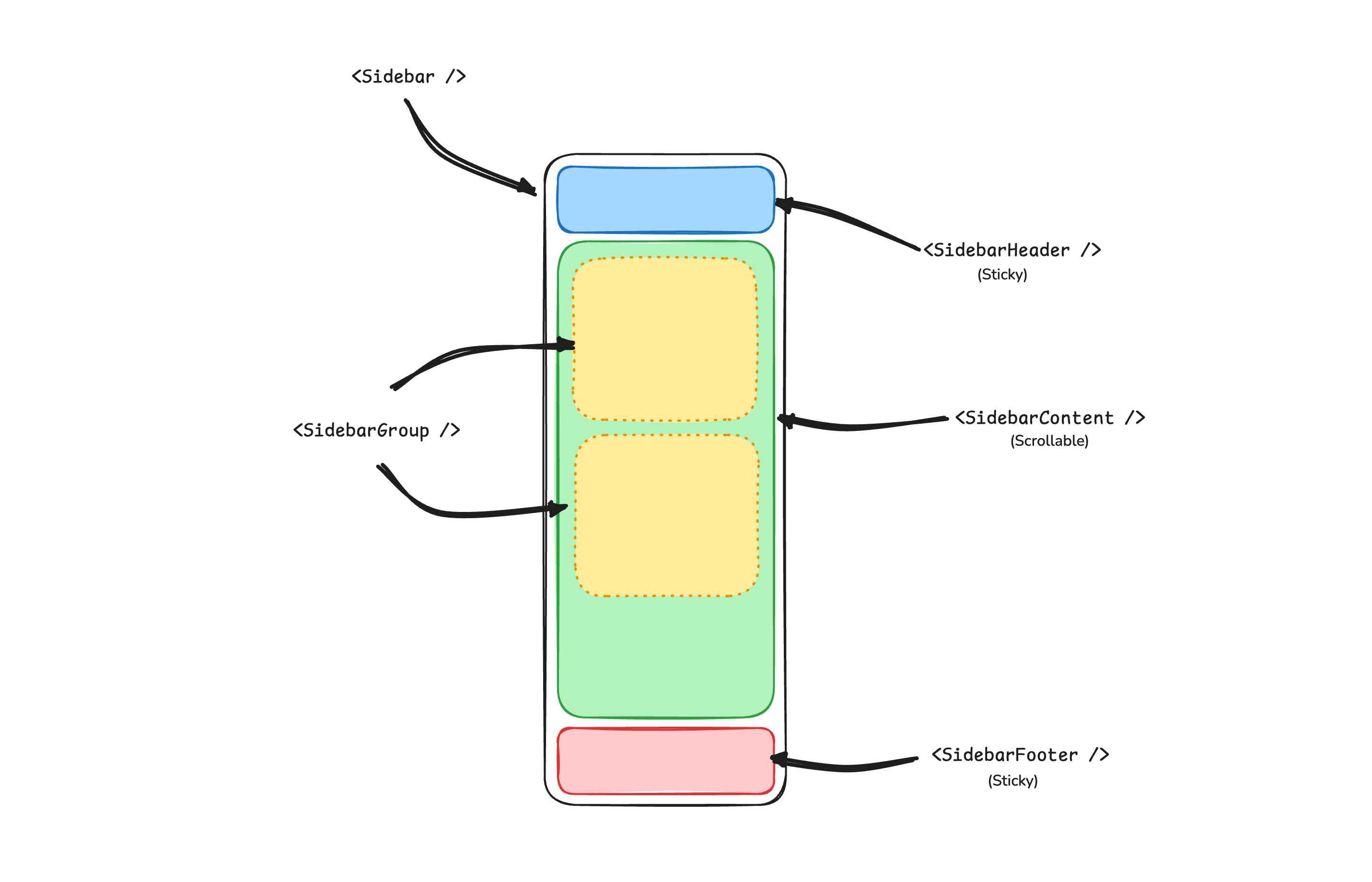
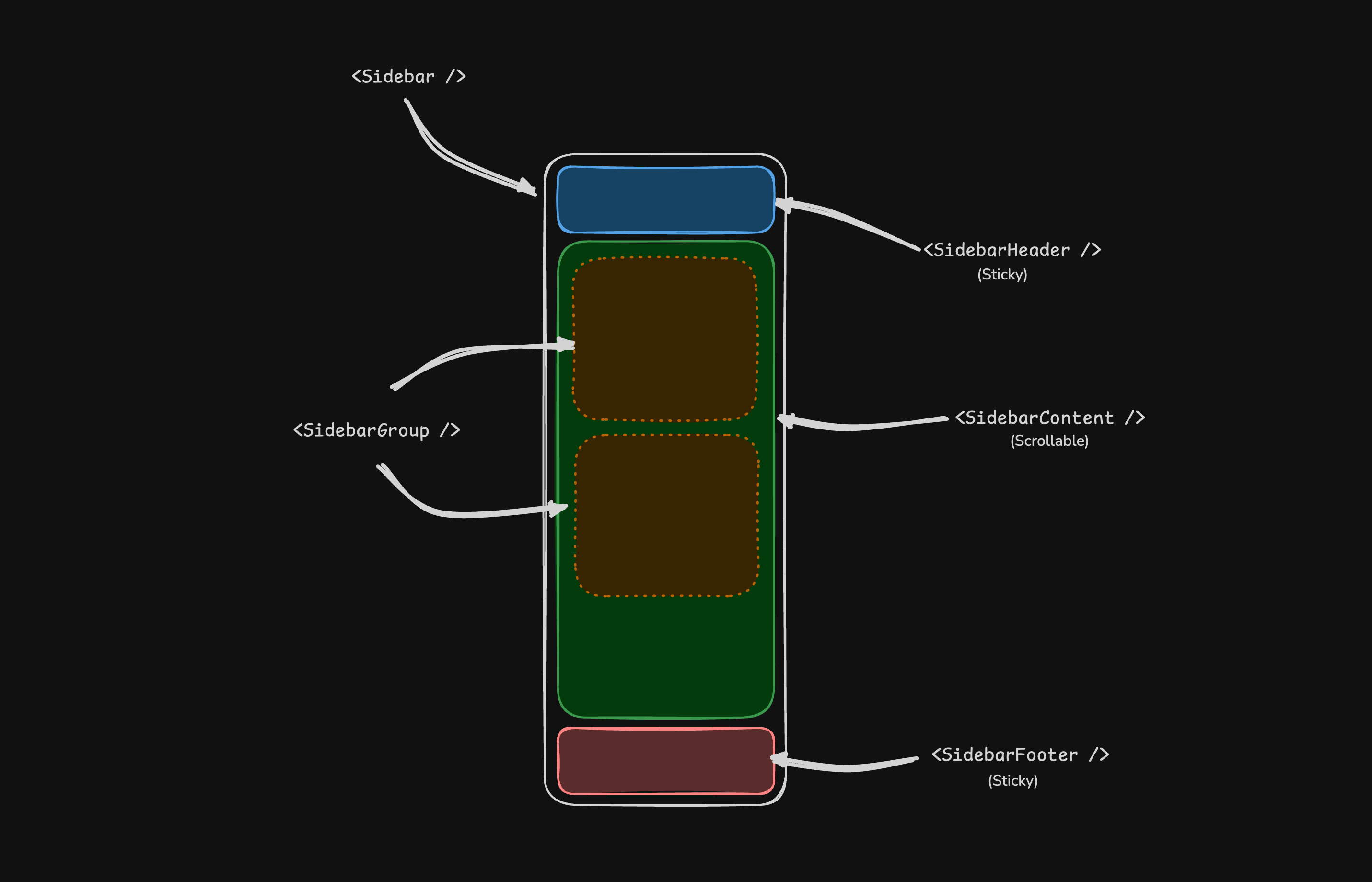
A Sidebar component is composed of the following parts:
Sidebar.Provider- Handles collapsible state.Sidebar.Root- The sidebar container.Sidebar.HeaderandSidebar.Footer- Sticky at the top and bottom of the sidebar.Sidebar.Content- Scrollable content.Sidebar.Group- Section within theSidebar.Content.Sidebar.Trigger- Trigger for theSidebar.
Usage
<script lang="ts">
  import * as Sidebar from '$lib/components/ui/sidebar/index.js';
  import AppSidebar from '$lib/components/app-sidebar.svelte';

  let { children } = $props();
</script>

<Sidebar.Provider>
  <AppSidebar />
  <main>
    <Sidebar.Trigger />
    {@render children?.()}
  </main>
</Sidebar.Provider><script lang="ts">
import * as Sidebar from '$lib/components/ui/sidebar/index.js';
</script>
<Sidebar.Root>
<Sidebar.Header />
<Sidebar.Content>
<Sidebar.Group />
<Sidebar.Group />
</Sidebar.Content>
<Sidebar.Footer />
</Sidebar.Root>Your First Sidebar
Let's start with the most basic sidebar. A collapsible sidebar with a menu.
Add a Sidebar.Provider and Sidebar.Trigger at the root of your application.
<script lang="ts">
  import * as Sidebar from '$lib/components/ui/sidebar/index.js';
  import AppSidebar from '$lib/components/app-sidebar.svelte';

  let { children } = $props();
</script>

<Sidebar.Provider>
  <AppSidebar />
  <main>
    <Sidebar.Trigger />
    {@render children?.()}
  </main>
</Sidebar.Provider>Create a new sidebar component at src/lib/components/app-sidebar.svelte.
<script lang="ts">
  import * as Sidebar from '$lib/components/ui/sidebar/index.js';
</script>

<Sidebar.Root>
  <Sidebar.Content />
</Sidebar.Root>Now, let's add a Sidebar.Menu to the sidebar.
We'll use the Sidebar.Menu component in a Sidebar.Group.
<script lang="ts">
  import CalendarIcon from '@lucide/svelte/icons/calendar';
  import HouseIcon from '@lucide/svelte/icons/house';
  import InboxIcon from '@lucide/svelte/icons/inbox';
  import SearchIcon from '@lucide/svelte/icons/search';
  import SettingsIcon from '@lucide/svelte/icons/settings';
  import * as Sidebar from '$lib/components/ui/sidebar/index.js';

  // Menu items.
  const items = [
    {
      title: 'Home',
      url: '#',
      icon: HouseIcon
    },
    {
      title: 'Inbox',
      url: '#',
      icon: InboxIcon
    },
    {
      title: 'Calendar',
      url: '#',
      icon: CalendarIcon
    },
    {
      title: 'Search',
      url: '#',
      icon: SearchIcon
    },
    {
      title: 'Settings',
      url: '#',
      icon: SettingsIcon
    }
  ];
</script>

<Sidebar.Root>
  <Sidebar.Content>
    <Sidebar.Group>
      <Sidebar.GroupLabel>Application</Sidebar.GroupLabel>
      <Sidebar.GroupContent>
        <Sidebar.Menu>
          {#each items as item (item.title)}
            <Sidebar.MenuItem>
              <Sidebar.MenuButton>
                {#snippet child({ props })}
                  <a href={item.url} {...props}>
                    <item.icon />
                    <span>{item.title}</span>
                  </a>
                {/snippet}
              </Sidebar.MenuButton>
            </Sidebar.MenuItem>
          {/each}
        </Sidebar.Menu>
      </Sidebar.GroupContent>
    </Sidebar.Group>
  </Sidebar.Content>
</Sidebar.Root>Components
The components in the sidebar-*.svelte files are built to be composable i.e you build your sidebar by putting the provided components together. They also compose well with other Kura components such as DropdownMenu, Collapsible, Dialog, etc.
If you need to change the code in the sidebar-*.svelte files, you are encouraged to do so. The code is yours. Use the provided components as a starting point to build your own
In the next sections, we'll go over each component and how to use them.
Sidebar.Provider
The Sidebar.Provider component is used to provide the sidebar context to the Sidebar component. You should always wrap your application in a Sidebar.Provider component.
Props
Width
If you have a single sidebar in your application, you can use the SIDEBAR_WIDTH and SIDEBAR_WIDTH_MOBILE constants in src/lib/components/ui/sidebar/constants.ts to set the width of the sidebar.
export const SIDEBAR_WIDTH = '16rem';
export const SIDEBAR_WIDTH_MOBILE = '18rem';For multiple sidebars in your application, you can use the style prop to set the width of the sidebar.
To set the width of the sidebar, you can use the --sidebar-width and --sidebar-width-mobile CSS variables in the style prop.
<Sidebar.Provider style="--sidebar-width: 20rem; --sidebar-width-mobile: 20rem;">
  <Sidebar.Root />
</Sidebar.Provider>This will not only handle the width of the sidebar but also the layout spacing.
Keyboard Shortcut
The SIDEBAR_KEYBOARD_SHORTCUT variable in src/lib/components/ui/sidebar/constants.ts is used to set the keyboard shortcut used to open and close the sidebar.
To trigger the sidebar, you use the cmd+b keyboard shortcut on Mac and ctrl+b on Windows.
You can change the keyboard shortcut by changing the value of the SIDEBAR_KEYBOARD_SHORTCUT variable.
export const SIDEBAR_KEYBOARD_SHORTCUT = 'b';Sidebar.Root
The main Sidebar component used to render a collapsible sidebar.
<script lang="ts">
  import * as Sidebar from '$lib/components/ui/sidebar/index.js';
</script>

<Sidebar.Root />Props
side
Use the side prop to change the side of the sidebar.
Available options are left and right.
<Sidebar.Root side="left | right" />variant
Use the variant prop to change the variant of the sidebar.
Available options are sidebar, floating and inset.
<Sidebar.Root variant="sidebar | floating | inset" />Note: If you use the inset variant, remember to wrap your main content
in a SidebarInset component.
<Sidebar.Provider>
  <Sidebar.Root variant="inset">
    <Sidebar.Inset>
      <main>
        <!-- Your main content -->
      </main>
    </Sidebar.Inset>
  </Sidebar.Root>
</Sidebar.Provider>collapsible
Use the collapsible prop to make the sidebar collapsible.
Available options are offcanvas, icon and none.
<Sidebar.Root collapsible="offcanvas | icon | none" />useSidebar
The useSidebar function is used to hook into the sidebar context. It returns a reactive class instance, so it cannot be destructured. Additionally, it must be called during the lifecycle of the component.
<script lang="ts">
  import { useSidebar } from '$lib/components/ui/sidebar/index.js';
  const sidebar = useSidebar();

  // ...

  sidebar.state;
  sidebar.isMobile;
  sidebar.toggle();
</script>Sidebar.Header
Use the Sidebar.Header component to add a sticky header to the sidebar.
The following example adds a <DropdownMenu> to the Sidebar.Header.
<Sidebar.Root>
  <Sidebar.Header>
    <Sidebar.Menu>
      <Sidebar.MenuItem>
        <DropdownMenu.Root>
          <DropdownMenu.Trigger>
            {#snippet child({ props })}
              <Sidebar.MenuButton {...props}>
                Select Workspace
                <ChevronDown class="ms-auto" />
              </Sidebar.MenuButton>
            {/snippet}
          </DropdownMenu.Trigger>
          <DropdownMenu.Content class="w-(--bits-dropdown-menu-anchor-width)">
            <DropdownMenu.Item>
              <span>Acme Inc</span>
            </DropdownMenu.Item>
            <DropdownMenu.Item>
              <span>Acme Corp.</span>
            </DropdownMenu.Item>
          </DropdownMenu.Content>
        </DropdownMenu.Root>
      </Sidebar.MenuItem>
    </Sidebar.Menu>
  </Sidebar.Header>
</Sidebar.Root>Sidebar.Footer
Use the Sidebar.Footer component to add a sticky footer to the sidebar.
The following example adds a <DropdownMenu> to the Sidebar.Footer.
<Sidebar.Provider>
  <Sidebar.Root>
    <Sidebar.Header />
    <Sidebar.Content />
    <Sidebar.Footer>
      <Sidebar.Menu>
        <Sidebar.MenuItem>
          <DropdownMenu.Root>
            <DropdownMenu.Trigger>
              {#snippet child({ props })}
                <Sidebar.MenuButton
                  {...props}
                  class="data-[state=open]:bg-sidebar-accent data-[state=open]:text-sidebar-accent-foreground"
                >
                  Username
                  <ChevronUp class="ms-auto" />
                </Sidebar.MenuButton>
              {/snippet}
            </DropdownMenu.Trigger>
            <DropdownMenu.Content side="top" class="w-(--bits-dropdown-menu-anchor-width)">
              <DropdownMenu.Item>
                <span>Account</span>
              </DropdownMenu.Item>
              <DropdownMenu.Item>
                <span>Billing</span>
              </DropdownMenu.Item>
              <DropdownMenu.Item>
                <span>Sign out</span>
              </DropdownMenu.Item>
            </DropdownMenu.Content>
          </DropdownMenu.Root>
        </Sidebar.MenuItem>
      </Sidebar.Menu>
    </Sidebar.Footer>
  </Sidebar.Root>
  <Sidebar.Inset>
    <header class="flex h-12 items-center justify-between px-4">
      <Sidebar.Trigger />
    </header>
  </Sidebar.Inset>
</Sidebar.Provider>Sidebar.Content
The Sidebar.Content component is used to wrap the content of the sidebar. This is where you add your Sidebar.Group components. It is scrollable.
<Sidebar.Root>
  <Sidebar.Content>
    <Sidebar.Group />
    <Sidebar.Group />
  </Sidebar.Content>
</Sidebar.Root>Sidebar.Group
Use the Sidebar.Group component to create a section within the sidebar.
A Sidebar.Group has a Sidebar.GroupLabel, a Sidebar.GroupContent and an optional Sidebar.GroupAction.
<Sidebar.Root>
  <Sidebar.Content>
    <Sidebar.Group>
      <Sidebar.GroupLabel>Application</Sidebar.GroupLabel>
      <Sidebar.GroupAction>
        <Plus /> <span class="sr-only">Add Project</span>
      </Sidebar.GroupAction>
      <Sidebar.GroupContent></Sidebar.GroupContent>
    </Sidebar.Group>
  </Sidebar.Content>
</Sidebar.Root>Collapsible Sidebar.Group
To make a Sidebar.Group collapsible, wrap it in a Collapsible.
<Collapsible.Root open class="group/collapsible">
  <Sidebar.Group>
    <Sidebar.GroupLabel>
      {#snippet child({ props })}
        <Collapsible.Trigger {...props}>
          Help
          <ChevronDown
            class="ms-auto transition-transform group-data-[state=open]/collapsible:rotate-180"
          />
        </Collapsible.Trigger>
      {/snippet}
    </Sidebar.GroupLabel>
    <Collapsible.Content>
      <Sidebar.GroupContent />
    </Collapsible.Content>
  </Sidebar.Group>
</Collapsible.Root>Note: We wrap the Collapsible.Trigger in a Sidebar.GroupLabel to render
a button.
Sidebar.GroupAction
Use the Sidebar.GroupAction component to add an action to a Sidebar.Group.
<Sidebar.Group>
  <Sidebar.GroupLabel>Projects</Sidebar.GroupLabel>
  <Sidebar.GroupAction title="Add Project">
    <Plus /> <span class="sr-only">Add Project</span>
  </Sidebar.GroupAction>
  <Sidebar.GroupContent />
</Sidebar.Group>Sidebar.Menu
The Sidebar.Menu component is used for building a menu within a Sidebar.Group.
A Sidebar.Menu is composed of Sidebar.MenuItem, Sidebar.MenuButton, Sidebar.MenuAction, and Sidebar.MenuSub components.
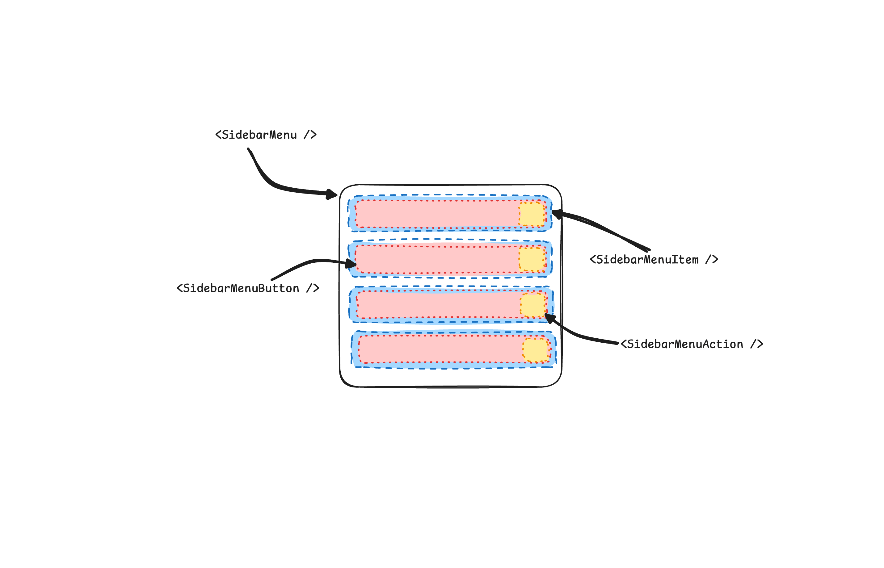
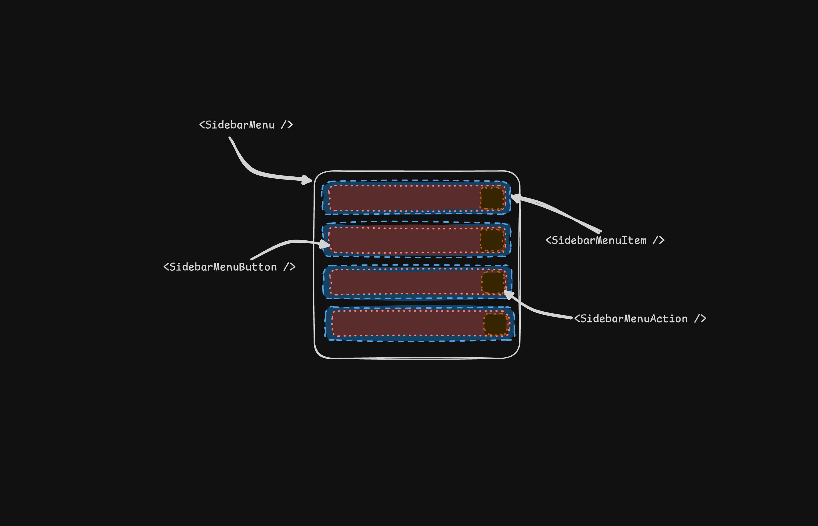
Here's an example of a Sidebar.Menu component rendering a list of projects.
<Sidebar.Root>
  <Sidebar.Content>
    <Sidebar.Group>
      <Sidebar.GroupLabel>Projects</Sidebar.GroupLabel>
      <Sidebar.GroupContent>
        <Sidebar.Menu>
          {#each projects as project}
            <Sidebar.MenuItem>
              <Sidebar.MenuButton>
                {#snippet child({ props })}
                  <a href={project.url} {...props}>
                    <project.icon />
                    <span>{project.name}</span>
                  </a>
                {/snippet}
              </Sidebar.MenuButton>
            </Sidebar.MenuItem>
          {/each}
        </Sidebar.Menu>
      </Sidebar.GroupContent>
    </Sidebar.Group>
  </Sidebar.Content>
</Sidebar.Root>Sidebar.MenuButton
The Sidebar.MenuButton component is used to render a menu button within a Sidebar.Menu.
Link or Anchor
By default, the Sidebar.MenuButton renders a button, but you can use the child snippet to render a different component such as an <a> tag.
<Sidebar.MenuButton>
  {#snippet child({ props })}
    <a href="/docs" {...props}> Home </a>
  {/snippet}
</Sidebar.MenuButton>Icon and Label
You can render an icon and a truncated label inside the button. Remember to wrap the label in a <span> tag.
<Sidebar.MenuButton>
  {#snippet child({ props })}
    <a href="/docs" {...props}>
      <House />
      <span>Home</span>
    </a>
  {/snippet}
</Sidebar.MenuButton>isActive
Use the isActive prop to mark a menu item as active.
<Sidebar.MenuButton isActive>
  {#snippet child({ props })}
    <a href="/docs" {...props}>
      <House />
      <span>Home</span>
    </a>
  {/snippet}
</Sidebar.MenuButton>Sidebar.MenuAction
The Sidebar.MenuAction component is used to render a menu action within a Sidebar.Menu.
This button works independently of the Sidebar.MenuButton, i.e. you can have the Sidebar.MenuButton as a clickable link and the Sidebar.MenuAction as a button.
<Sidebar.MenuItem>
  <Sidebar.MenuButton>
    {#snippet child({ props })}
      <a href="/docs" {...props}>
        <House />
        <span>Home</span>
      </a>
    {/snippet}
  </Sidebar.MenuButton>
  <Sidebar.MenuAction>
    <Plus /> <span class="sr-only">Add Project</span>
  </Sidebar.MenuAction>
</Sidebar.MenuItem>DropdownMenu
Here's an example of a Sidebar.MenuAction that renders a DropdownMenu.
<Sidebar.MenuItem>
  <Sidebar.MenuButton>
    {#snippet child({ props })}
      <a href="##" {...props}>
        <House />
        <span>Home</span>
      </a>
    {/snippet}
  </Sidebar.MenuButton>
  <DropdownMenu.Root>
    <DropdownMenu.Trigger>
      {#snippet child({ props })}
        <Sidebar.MenuAction {...props}>
          <Ellipsis />
        </Sidebar.MenuAction>
      {/snippet}
    </DropdownMenu.Trigger>
    <DropdownMenu.Content side="right" align="start">
      <DropdownMenu.Item>
        <span>Edit Project</span>
      </DropdownMenu.Item>
      <DropdownMenu.Item>
        <span>Delete Project</span>
      </DropdownMenu.Item>
    </DropdownMenu.Content>
  </DropdownMenu.Root>
</Sidebar.MenuItem>Sidebar.MenuSub
The Sidebar.MenuSub component is used to render a submenu within a Sidebar.Menu.
Use Sidebar.MenuSubItem and Sidebar.MenuSubButton to render a submenu item.
<Sidebar.MenuItem>
  <Sidebar.MenuButton />
  <Sidebar.MenuSub>
    <Sidebar.MenuSubItem>
      <Sidebar.MenuSubButton />
    </Sidebar.MenuSubItem>
    <Sidebar.MenuSubItem>
      <Sidebar.MenuSubButton />
    </Sidebar.MenuSubItem>
  </Sidebar.MenuSub>
</Sidebar.MenuItem>Collapsible Sidebar.Menu
To make a Sidebar.Menu collapsible, wrap it and the Sidebar.MenuSub components in a Collapsible.
<Sidebar.Menu>
  <Collapsible.Root open class="group/collapsible">
    <Sidebar.MenuItem>
      <Collapsible.Trigger>
        {#snippet child({ props })}
          <Sidebar.MenuButton {...props} />
        {/snippet}
      </Collapsible.Trigger>
      <Collapsible.Content>
        <Sidebar.MenuSub>
          <Sidebar.MenuSubItem />
        </Sidebar.MenuSub>
      </Collapsible.Content>
    </Sidebar.MenuItem>
  </Collapsible.Root>
</Sidebar.Menu>Sidebar.MenuBadge
The Sidebar.MenuBadge component is used to render a badge within a Sidebar.MenuItem.
<Sidebar.MenuItem>
  <Sidebar.MenuButton />
  <Sidebar.MenuBadge>24</Sidebar.MenuBadge>
</Sidebar.MenuItem>Sidebar.MenuSkeleton
The Sidebar.MenuSkeleton component is used to render a skeleton within a Sidebar.MenuItem. You can use this to show a loading state while waiting for data to load.
<Sidebar.Menu>
  {#each Array.from({ length: 5 }) as _, index (index)}
    <Sidebar.MenuItem>
      <Sidebar.MenuSkeleton />
    </Sidebar.MenuItem>
  {/each}
</Sidebar.Menu>Sidebar.Separator
The Sidebar.Separator component is used to render a separator within a Sidebar.
<Sidebar.Root>
  <Sidebar.Header />
  <Sidebar.Separator />
  <Sidebar.Content>
    <Sidebar.Group />
    <Sidebar.Separator />
    <Sidebar.Group />
  </Sidebar.Content>
</Sidebar.Root>Sidebar.Trigger
Use the Sidebar.Trigger component to render a button that toggles the sidebar.
The Sidebar.Trigger component must be used within a Sidebar.Provider.
<Sidebar.Provider>
  <Sidebar.Root />
  <main>
    <Sidebar.Trigger />
  </main>
</Sidebar.Provider>Custom Trigger
To create a custom trigger, you can use the useSidebar hook.
<script lang="ts">
  import { useSidebar } from '$lib/components/ui/sidebar/index.js';
  const sidebar = useSidebar();
</script>

<button onclick={() => sidebar.toggle()}>Toggle Sidebar</button>Sidebar.Rail
The Sidebar.Rail component is used to render a rail within a Sidebar.Root. This rail can be used to toggle the sidebar.
<Sidebar.Root>
  <Sidebar.Header />
  <Sidebar.Content>
    <Sidebar.Group />
  </Sidebar.Content>
  <Sidebar.Footer />
  <Sidebar.Rail />
</Sidebar.Root>Controlled Sidebar
Use Svelte's Function Binding to control the sidebar state.
<script lang="ts">
  import * as Sidebar from '$lib/components/ui/sidebar/index.js';

  let myOpen = $state(true);
</script>

<Sidebar.Provider bind:open={() => myOpen, (newOpen) => (myOpen = newOpen)}>
  <Sidebar.Root />
</Sidebar.Provider>

<!-- or -->

<Sidebar.Provider bind:open>
  <Sidebar.Root />
</Sidebar.Provider>Theming
We use the following CSS variables to theme the sidebar.
:root {
  --sidebar: oklch(0.985 0 0);
  --sidebar-foreground: oklch(0.145 0 0);
  --sidebar-primary: oklch(0.205 0 0);
  --sidebar-primary-foreground: oklch(0.985 0 0);
  --sidebar-accent: oklch(0.97 0 0);
  --sidebar-accent-foreground: oklch(0.205 0 0);
  --sidebar-border: oklch(0.922 0 0);
  --sidebar-ring: oklch(0.708 0 0);
}

.dark {
  --sidebar: oklch(0.205 0 0);
  --sidebar-foreground: oklch(0.985 0 0);
  --sidebar-primary: oklch(0.488 0.243 264.376);
  --sidebar-primary-foreground: oklch(0.985 0 0);
  --sidebar-accent: oklch(0.269 0 0);
  --sidebar-accent-foreground: oklch(0.985 0 0);
  --sidebar-border: oklch(1 0 0 / 10%);
  --sidebar-ring: oklch(0.439 0 0);
}We intentionally use different variables for the sidebar and the rest of the application to make it easy to have a sidebar that is styled differently from the rest of the application. Think a sidebar with a darker shade from the main application.
Styling
Here are some tips for styling the sidebar based on different states.
- Styling an element based on the sidebar collapsible state. The following will hide the
Sidebar.Groupwhen the sidebar is iniconmode.
<Sidebar.Root collapsible="icon">
  <Sidebar.Content>
    <Sidebar.Group class="group-data-[collapsible=icon]:hidden" />
  </Sidebar.Content>
</Sidebar.Root>- Styling a menu action based on the menu button active state. The following will force the menu action to be visible when the menu button is active.
<Sidebar.MenuItem>
  <Sidebar.MenuButton />
  <Sidebar.MenuAction class="peer-data-[active=true]/menu-button:opacity-100" />
</Sidebar.MenuItem>You can find more tips on using states for styling in this Twitter thread.